[x]

deviantART


©2006-2009 *domnx
Details
Submitted: June 9, 2006
File Size: 152 KB
Image Size: 53.5 KB
Resolution: 238×324
Comments: 136
Favourites & Collections: 797 [who?]

Views
Total: 18,957
Today: 0

Downloads
Total: 856
Today: 0

Thumb

Artist's Comments

This will be part 1 of my 'Russian Revolution' series/triptych (maybe). I really admire these Soviet posters done back in the early 20th century, with the limited use of colors and the strong message.

My only problem was that it always contained some pudgy male industrial worker, some burly soviet soldier or some old babushka lady looking sad.

So here's my take on it with the usual pin-up flair.
Part II can be seen here: [link]

Dosvidanya!

I give Deviant Dolls permission to post into their gallery
Daily Deviation, 2007-08-20

Daily Deviation
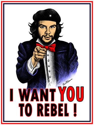
Revolution by *domnx. A modern day pin-up slant on a Soviet Russia poster design. If chicks like this had been on posters back then, who knows where the revolution may have led to! A wicked design from a very cool artist. (Featured by $chix0r)

[x]

Devious Comments

love 3 3 joy 5 5 wow 2 2 mad 0 0 sad 0 0 fear 0 0 neutral 0 0

Comments


Well, Russia is good for something.

--
The best webcomic starring Deadpool EVER: [link]
Itīs remind me Little Red Hat and also China... :XD: hehehe...Those Soviet posters were limited, but also so creative... I admire how human being could be creative even though in difficult times ^__^

By the way, beautiful job ! Awesome Soviet Little Red Hat pin-up in China...

Just kidding, ok?!

--
^^
this is awesome - i can't wait for the rest!
BOSHE MOI!!! That is awesome!!

I love the style, the composition, the colors, how you've solved the countless posible tangents, etc. It has power, it has glam and just plain works as a pin-up style.

I understand the point behind the aging effect, but... In my opinion it isn't really necessary. I've seen many modern illustrators do work in this style, and they've all thought better about the aging thing. After all, it's obvious that we're looking at new work, so why deface it? I much rather see the original art intact. In my opinion the bit of cleverness added by aging isn't worth the trade of what you lose. But this is just a very personal opinion. It's your art and it does look fabulous either way, so aging or not, I put it in my faves. Espasibo!

--
Don't be shy... just CLICK! [link]
"This could be the beginning of a beautiful friendship"
this is way past cool.....really really like it!!
the way you made it look like it has been hanging on a wall for ages is really effective, looking forward to the others

--
You eat pieces of shit for breakfast!?
Thanks for the comments. I'll definitely keep it in mind for the future.

--
"You ask, is America ready for a black President? I say, why not? We just had a retarded one!"
-Chris Rock
Thanks for the comments. Some like the aging, others don't like it.

--
"You ask, is America ready for a black President? I say, why not? We just had a retarded one!"
-Chris Rock
mmmm shiny legs *lifts arms and fists up* i like the aging thing but why not post the version with out the aging effect?
Cool! I've been watching your stuff for a while and this is definetely my favourite piece yet!

--
Ross Radiation Zero

Weird Galaxy : Online Gallery - [link]

Blog:
[link]

Site Map